"Corporate Mergers" [DB / Robert Greenberg discussion]
Surface, Issue No. 20
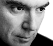
They’ve made careers of injecting popular culture with a wicked sense of humor & eccentric social commentary. From an education in graphic design, to band leading a new wave of ‘art school’ pop music, to becoming a bona fide record label head, David Byrne remains committed to spreading a satirical & surreal manifesto. Robert Greenberg is the acclaimed pioneer of digital media who infuses the corporate realm with a similarly quirky humor & fresh aesthetic innovation. Here, the two subversive talking heads discuss infiltrating market psychology & exploring the creative potential of corporate culture…
Everything’s starting to add up. The Talking Heads moniker, the business suits with gigantic shoulder pads — David Byrne has a corporate fetish. The latest evidence is in his new book, Your Action World. Packaged by designer Stefan Sagmeister in a plastic bag, the book compiles Byrne’s studies of corporate boardrooms, signage and hotel suites; and graphic spoofs on motivational self-help messages. Byrne, who currently heads up his own company, the Luaka Bop record label, has explained that, “to understand the enemy, I must become one with the enemy, I must be of one mind with the enemy. I must infect myself in order to be immunized.”
Surface paired Byrne with a corporate ‘nemesis,’ the infectious commercial director Robert Greenberg. Together, they examine corporate culture and its modes of communication from the inside and the out.
Robert Greenberg: Why are you so interested in marketing? And in the words, identity images and color relationships that corporations use?
David Byrne: Some ad copy or motivational literature…to me it’s a kind of poetry, really strange poetry. When it really affects me is when it’s off kilter enough so that it doesn’t make logical sense. It might feel right, it might strike the right chord — that’s intended. But when you stand back and look at it in an objective way, it’s kind of surreal. I find that kind of pleasant, that destruction. Here’s a kind of poetry or surrealism that’s happening on a large scale. It’s a far cry from these outsider artists in a backyard, or in a hospital. It’s probably somebody working in an office or in a nice house, and producing something that’s kind of strange. So, I think that here’s a kind of unwitting surrealism or creativity that’s happening on a national scale or a global scale, that’s very pervasive and somewhat unacknowledged. It gets talked about in economic terms, of how successfully something works or doesn’t. But now one just stands back and looks at it for what I think this work is, which is genuinely strange things that are put into the world. They’re scripted in a way so that they fit in everywhere. They don’t stand out as being unusual in an unpleasant way. The disruption that they cause is acceptable. It’s a disruption that people may find pleasant. There’s a whole language being spoken here.
You’re onto a really big idea. David Ogilvy invented modern advertising. He created a modern agency that taps into some psychological repository in people that gets them to react, to feel connected to a brand and to want to do something about it — whether it is to buy it, or buy stock, or to communicate positive things about it to other people. There’s PhD’s, psychoanalysts, there’s a tremendous amount of testing that happens. It has become so scientific that it’s very powerful. The prototype, the best design, is the Nazi swastika. It came out of an Indian icon that is very powerful. The colors they choose aren’t just arbitrary. They really tap into what motivates people. And then at the base of it, it’s an art from. Some of the best slogans — “Drivers wanted,” VW; IBM’s logo and their copyrighted “Solutions for a small planet” — they work on that forever. “We bring good things to life,” “Pepsi Generation.” I’ve been, for the pas four or five years, on the board of the Association of Independent Commercial Producers, which puts on a show each year at the Museum of Modern Art. The award given is that their reel is put in the permanent archive of the museum. The curators of the film department realize that some of the commercial work is actually fine art. And many artists like Warhol take the Campbell soup can and make it a large icon, or recognize that it is an icon.
I think that even fine artists get into a style that is so recognizable that they essentially produce a logo for themselves. They’ve made their work into one large logo. Basically, they change the size, they change the color, they’ve made their work into a logo that they sell over and over again.
A lot of it is probably subliminal to them. It’s affected by so many things, the mass media. Artists have changed over the course of the last many years to be very different.
Where is the line, or maybe, there isn’t one any more, between what we should call an artist, and a creative person who works in your office? Where’s the dividing line? You could say an artist is always selling their won work; they make something, they sell it, there’s not third party involved. They’re not directing your interest towards something else. But then it gets very confusing, because the artist, and the institution that they’re being presented in, is being supported or funded by a corporation. Or they’re doing work for Absolut ads, or doing fashion photography and fine art photography that looks almost the same, sometimes is the same.
It’s why I collect fine art. I was actually looking for something that was totally unfiltered, by somebody who was isolated, perhaps in an institution. And preferably schizophrenic, because I was really looking for an unfiltered, singular vision. An artist such as yourself, a musician, is about the declamation of the talking heads. It’s something where you can control the process to a large degree. An artist can have a very singular experience with paints and oil and canvas. But they go through a process—the university training program, coming out, being discovered in the right place. That there is a big filtering process. You went to RISD [Rhode Island School of Design], is that right?
For a little while.
So you’ve always been into graphic design?
Oh, yeah.
I can see it in your album covers and in the clothes that you wear.
It’s always fun to parallel with music. And I didn’t always know from which one I’d be able to make a living. It was always an equal level of passion.
Did you formally study photography, or did you just pick it up?
I had a little bit of work in the dark room with black and white. When I came to New York, I was working as a ‘stat man’ [lithographic camera operator]. For me at the time it was kind of ideal. “This is perfect, I’m working in the dark room, I can play the radio and listen to whatever station I want. And when they don’t need me to make a statter, set type or do whatever, I can make posters for the band! I can make band posters or album covers or single sleeves or whatever.” And so for a little while it was kind of ideal.
I’m a huge fan of [art director] Tibor Kalman. I’d assume he was a major influence [on you]. I feel Tibor had similar interests, in terms of reacting to mass culture and mass media, and trying to be a little more shocking. And also in the work of [graphic designer] Stefan Sagmeister…there is a sense of humor that travels through everything — humor, whimsy, comedy. Is that true?
Yes. Absolutely. Tibor was very inspiring, so was Stefan. Both in that they were not about typeface or layout. They go straight to “What’s this about? What’s the concept here, what’s the content here?” And work it out from there.
I think that the best graphic designers that I know are the ones that are conceptual, who can think on many levels come up with an original idea.
When you’re working on films or websites or ads, is there a push and pull between text and image? When I was working on this book, at an early point, various images got some text and slapped on them. And I realized immediately that text just takes over, becomes boss. It starts saying, “I’m telling you what the image is about.” Instead of the image having equal weight and influence on the text. It’s like when you go look at a painting or a work of art. And you have the title, a little tiny thing written on the wall. People will go up close to it, look at the title: “That’s what this is about.” So, at one point, I played with the computer, recessed and sinked the text into the innerservice…almost illegible, almost invisible. Which was fun to do , but became really frustrating. So, I though, ‘Ok, how do we deal with this?’ Because I think that images, sound, and these monolinguistic things can move people in a deeper way sometimes than a text.
Much of the work I do is with moving images, and text plays a subservient role. Television is a ‘lean back’ experience, and really don’t want to read. As soon as you put it out on a printed page, the text plays a more important role. In the work that you’ve done in music and that you’re doing in print, the word means so much. A lot of musicians, their words get lost in the music. And in your work, the words come through. I’m not sure exactly why. I presume it is because you want them to.
I guess so. In part, yes, I do want them to. But I’m also afraid that they’re going to take over. Because I always feel that they only carry part of the meaning. The other part is how they go up against the other stuff: the sound, the visuals, the rhythm. Anything else that tells you what the words really mean.
Some of the photography [in Your Action World] is really interesting—the architecture of a hotel roof, the colors that they choose. These aren’t chosen arbitrarily either. They’re really meant to welcome the ordinary visitor, at least that’s what they think.
I really enjoy entering those places, because it’s like a theme park. I’m stepping into somebody else’s life, maybe a traveling salesman. I’m stepping into the room as they would like, it’s not the way I would have made it. You’ve definitely stepped into this theme bedroom.
It’s very strange. I mean, the big chains go to incredible lengths…everything is chosen, absolutely everything down to the smallest detail by people who are, theoretically, experts. All the way from Howard Johnson and its colored ceiling, to something like the Four Seasons, and the new boutique hotels. And in some of the new boutique hotels, you can’t find the toilet paper. They’re tapping into something that people react to in some way, because people keep going back to those hotels. If they didn’t have repeat business, they wouldn’t be around. I think that it’s an important part of cultural history that you’re capturing.
It’s a little bit of the idea that in a small detail you can find the whole universe. In a bedspread, in a way a hotel is designed, in a hallway or whatever. You can see the whole system of values of at least part of a society without being critical, without being judgmental. You can read without text, you can read the image and because it’s so familiar, because you know exactly what it is, exactly where it is, you might be able to look at that hotel room and know what year it is. People have this amazing visual memory and grammar and understanding that is unspoken but it’s all in there.
I think that you could actually tell an entire story based on internationally accepted icons. I remember once accidentally walking into the women’s room, and I remember hearing voices and thinking, “Wow, so strange, the voices are so high pitched.” And then I realized I was in the women’s room, and I ran out. I realized I didn’t notice the icon on the bathroom door, and I saw the skirt then. Airport designs are really fascinating. It’s really the closest thing to the Web because you come into a space and you have to be able to find your way, very specifically, usually under time pressure.
And you’re tired.
And people who haven’t flown much get it. It’s pretty remarkable iconography and architecture.
I must say that I still get excited about airports. Like there’s a new wing in the Charles de Gaulle. I don’t know who the architect is, but it’s incredibly futuristic looking, so even though I’m not quite sure where I’m going, I just walk in there and think “This is amazing. This is how we thought the future was going to look. It wasn’t going to be just steel and glass boxes, it was going to be like this.”